![Digimon UP Tier List [Supports, Buddies, and Partners]](/wp-content/uploads/2026/07/digimon-up-tier-list.jpg "Digimon UP Tier List [Supports, Buddies, and Partners]")
Digimon UP Tier List [Supports, Buddies, and Partners]
These Digimon will get you UP the leaderboard.

![Haze Seas Boss Drops [Chances, Locations, and How to Spawn]](/wp-content/uploads/2026/07/haze-seas-boss-drops.jpg "Haze Seas Boss Drops [Chances, Locations, and How to Spawn]")

When we started making Verby!, one of the things that we decided was that the game needed to have a strong personality. Most of the word games on the App Store tend to all follow a similar playbook, and that leaves them all looking, and feeling, just a little bit familiar. This is something that we didn’t want to repeat with Verby!. We wanted something that stood out in the crowd.
When we started making Verby!, one of the things that we decided was that the game needed to have a strong personality. Most of the word games on the App Store tend to all follow a similar playbook, and that leaves them all looking, and feeling, just a little bit familiar. This is something that we didn’t want to repeat with Verby!. We wanted something that stood out in the crowd.
If you take a look back at our first developer diary, you’ll see that the look of the game has changed considerably. We’ve tested and refined and refined and tested, and we’re now at a stage where the personality of the game is really starting to shine through. And it’s only the beginning.

Verby’s old look
Verby’s new look
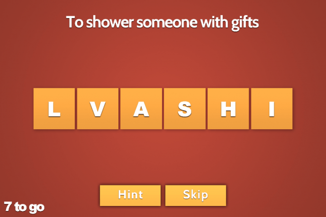
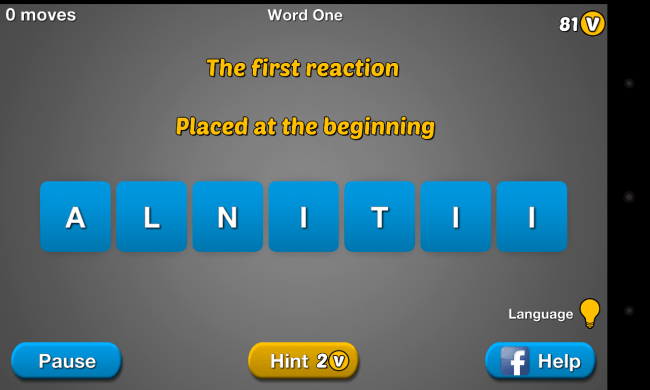
One of the first decisions we made that went against the tide was to set the game in landscape rather than portrait. We wanted the words to take center stage, and that meant making them nice and big and easy to manipulate. We think this makes the things a little more personal, and that it helps you focus while playing. And trust me: for some of these words, you’ll need focus.
One of the other factors that tends to make the others feel all the same is their reliance on standard native UI elements. These tend to leak the personality of the OS into the game, which has the effect of diluting the game’s impact. You end up feeling like you’re using a utility, rather than enjoying a game. With Verby! every UI element has been created with the game’s personality in mind, creating a cohesive and separate identity that we hope players will enjoy.
The other advantage of not mimicking a particular OS’s visual style is that we become device agnostic. Your experience on an Android device is the same as it is on an iDevice. In fact, you can start you game on your iPhone and continue it on your Galaxy Tab and you won’t even notice a difference.
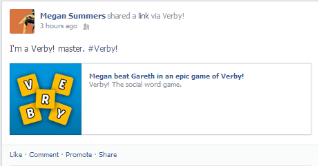
As we’re using virality as one of our acquisition strategies, it was important that the game had a distinct visual style that is instantly recognizable regardless of where the player (or potential player) sees it. Facebook posts asking for help are taken straight from the user’s device, so that when a new player decides to join a Verby! game, they have already dipped their toes in the Verby! world. Solving a word via a Facebook post and solving a word in game should be a very comparable experience.
One of the tasks we set for ourselves was to give the player the ability to customize the look of the game with different color schemes that can reflect the personality of the player. We also didn’t want to clog up social networks with the same sets of images all the time. We need to keep things fresh and interesting for both the player and their friends so that looking at Verby! is something they really want to do.
Now that the game is available as a limited release in certain regions, we’ll be able to get a real sense of what players do and don’t like about the game’s look and feel. We’ll keep refining and testing and testing and refining until Verby! is a game that everyone, everywhere enjoys and feels great about sharing it with their friends.
Screwtape Studios are Megan Summers, producer and designer and Anthony Wood, lead designer and programmer. Verby! TM is being published by Right Pedal Studios.
