![Hololive Dreams Tier List [Best Cards]](/wp-content/uploads/2026/07/hololive-dreams-tier-list.jpg "Hololive Dreams Tier List [Best Cards]")
Hololive Dreams Tier List [Best Cards]
The best cards for the best performances.


![Iron Soul Dungeon Weapon Tier List [Best Weapons]](/wp-content/uploads/2026/07/iron-soul-dungeon-weapon-tier-list.jpg "Iron Soul Dungeon Weapon Tier List [Best Weapons]")

It’s simply staggering to any new developer to think of how many creative decisions need to be made to develop a video game. Starting a new game is like starting with a blank canvas; every single detail that appears on the screen needs to be decided on by you. Then, after all those aesthetic decisions have been made, there are added layers of interactivity, and innumerable technical considerations.
It’s simply staggering to any new developer to think of how many creative decisions need to be made to develop a video game. Starting a new game is like starting with a blank canvas; every single detail that appears on the screen needs to be decided on by you. Then, after all those aesthetic decisions have been made, there are added layers of interactivity, and innumerable technical considerations.
Characters are dreamt up and animated, levels are built, and fonts need to be selected before a game is ever “finished.” Every single aspect of the player experience has to be considered to create a unified look and feel. That being said, “feel” has been our focus for this title since the beginning. We tried to create a game with a certain feel, one tempered by the advantages and limitations of the mobile platform.
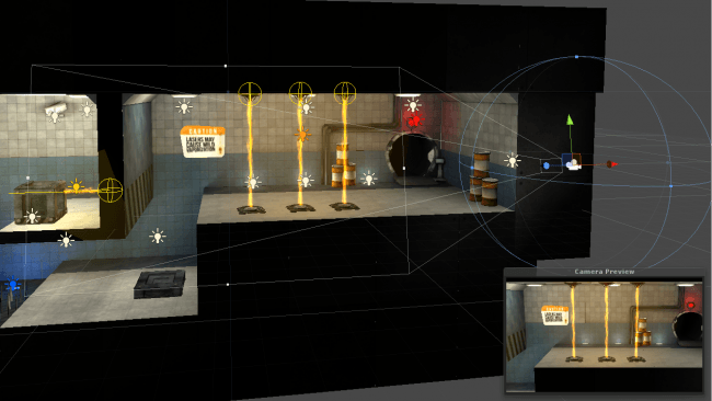
We wanted this game to be very immersive, which we felt has been underutilized in mobile gaming. We wanted the environments to feel very rich and believable, but given that the user might be playing our game on their phone, the puzzles needed to be “readable” even on small screens. Thus, one of our first design decisions was to make this title a 3D game. The beauty of designing a 3D title is getting to play around with lighting, which is absolutely a gift. In this case, we opted for more moody lighting, often stark and low-key, but ultimately realistic.
In a game like this, lighting contrast is key. We often employ very even and soft lighting throughout a level, then use brighter and more directional light to highlight puzzle elements, obstacles, or the occasional background joke. This is a great opportunity to “lead” the player through the level. Using lighting to highlight aspects of the puzzle is essential to the level “reading” on a mobile device. To make the lighting believable, even in a stylized environment, we tried to use something called “motivated lighting.” That is, lighting that appears to have a definite onscreen source. For example, lasers or fire throwing off realistic colors.
The thing is, such a detailed lighting setup can be very processor-heavy, which is not good for a mobile title. Thus, we opted to do light mapping. This is a process by which Unity will calculate out all the light and shadow generated by our in-game lights and “bake” them into the level textures. Instead of the lighting being rendered in real-time, it’s no more difficult to present than a texture, allowing us incredible freedom with our lighting setups but not taxing the user’s device too much.
Even little amounts of contrast can be key to presenting ideas to the player, but contrast is not exclusively a lighting principle: it covers every aspect of the design process. For example, one of the biggest points of contrast in the design of this game is in character contrast, especially in our hero himself. Though our protagonist Kyle has telekinetic powers, he’s ultimately just a shy kid thrust into extraordinary circumstances. As we’ve joked since early in our development, “he’s just a regular kid with regular telekinetic powers.” As such, a number of design decisions went into reinforcing this idea with character contrast.
Kyle has a stylized “cartoon” proportion. He has a large head and spindly limbs, with huge glasses that magnify his eyes, which has the added effect of making his expression easily read, even on small mobile screens. Unlike his more realistic and sinister surroundings, Kyle is cel-shaded and quite colorful. On the mobile side, this also makes Kyle always very visible on the mobile screen, even when zoomed out.
This idea of contrast is carried over into our color selection as well. The primary color throughout the game is blue. Kyle’s shirt is blue, as is his telekinesis effect. This allows us to use blue’s most contrasting color, orange, as an accent. As a pair of complimentary colors, working very well together naturally, we are able to create visually appealing levels, as well as use the great color contrast between the benign and cool blue and the hot and striking orange to highlight key elements or dangers. Indeed, our lasers are a vivid orange, and our fire definitely tends more towards the orange range. The memory orbs, a key plot point, are orange, emphasizing their importance.
In any design situation, you have to identify which principles of design you’ll choose to emphasize, and in our case it was definitely contrast, most notably in our lighting, character contrast, and color contrast. Contrast directs the player’s eye, helps the player empathize with our fish-out-of-water Kyle, and makes sure the game reads on a mobile device. This may seem like a criminal amount of overthinking for something that most people may not even notice, but that’s the developer’s burden: we put tons of thought into making sure people don’t think about these decisions at all.
About Vellum Interactive
Vellum Interactive was founded in July 2012 by Brian Reinhart and Daniel Luecke because of their life-long desire to create video games. We started the company with a few simple 2D games like the endless runner,DreamCat, but decided it was time to tackle a truly ambitious project. We hired Atlanta based sound designer Thomas Dalhberg, and we hired our first 3D artist, Delfin Diaz. We started work on Telekinesis Kyle in December 2012.

 “
“ “
“ “
“