![Digimon UP Tier List [Supports, Buddies, and Partners]](/wp-content/uploads/2026/07/digimon-up-tier-list.jpg "Digimon UP Tier List [Supports, Buddies, and Partners]")
Digimon UP Tier List [Supports, Buddies, and Partners]
These Digimon will get you UP the leaderboard.

![Haze Seas Boss Drops [Chances, Locations, and How to Spawn]](/wp-content/uploads/2026/07/haze-seas-boss-drops.jpg "Haze Seas Boss Drops [Chances, Locations, and How to Spawn]")

By the summer of 2010, it was clear that social gaming was here to stay, with Facebook’s massive audience continuing to demonstrate an appetite for games. However, the range of available games on Facebook was rather limited. A few early leaders, most notably Zynga’s FarmVille, had served as an example for countless other developers to follow, leading to a landscape overrun with simulation games primarily marketed to casual and non-gamers such as middleaged women playing games for the first time.
By the summer of 2010, it was clear that social gaming was here to stay, with Facebook’s massive audience continuing to demonstrate an appetite for games. However, the range of available games on Facebook was rather limited. A few early leaders, most notably Zynga’s FarmVille, had served as an example for countless other developers to follow, leading to a landscape overrun with simulation games primarily marketed to casual and non-gamers such as middleaged women playing games for the first time.
Around this time, at Gaia Interactive we were planning ways to expand our product line. Gaia was among the first companies to pioneer virtual goods monetization with our avatar-based community, Gaia Online, so we had effectively been developing “social games” for several years. It seemed clear that we had the team, talent, and technology necessary to capitalize on the opportunities of the Facebook platform. However, our core demographic—the audience we best understood— was gamers. The majority of Gaia’s users were between 13 to 30 years old, owned gaming consoles, and shunned Facebook games as not being as appealing or as fun as the games they were used to playing.
We had to make a decision: Should we follow the direction of other developers on Facebook? Or should we stick to what we know best and build a Facebook game for the audience of “gamers” who, thus far, hadn’t demonstrated much interest in Facebook games? In considering these options and arriving at our decision, we formed beliefs that became the foundation of our strategy. The value proposition of social gaming—the ability to play games instantly with your friends for free on a site you’re already visiting daily—is compelling to any audience, especially gamers. There simply weren’t many examples to draw from and in fact, the demand for games on Facebook wasn’t being met by the current supply. We believed that an enormous population of gamers would enjoy playing games on Facebook once there were games that appealed more to this audience. We felt that we could appeal to gamers by drawing inspiration from the most popular games from traditional consoles, and that in so doing we could expose new casual and nongamers to tried-and-true game mechanics that had delighted audiences for decades.
The Inspirations for Monster Galaxy
Monster Galaxy came from several different sources of inspiration. Our creative team, led by Gaia’s co-founder Charles Park, had longstanding ideas about incorporating a pet system into Gaia Online-ideas we had refined into various prototypes and explored in Gaia’s aquarium game. These ultimately became the foundational ideas behind Monster Galaxy. In addition, I had previously developed (fluff) Friends, one of the first games on Facebook, and so for over two years I had been musing about how to make a virtual pets game more engaging.
What’s more, all of us at Gaia loved console games. As we were discussing potential social game ideas, we did an intellectual exercise exploring all the top-selling console games of the past 30 years and discussing what each would look like on Facebook. How would these games look in that context? We wanted to create a game inspired by one of the most popular video games of all time—and for all the reasons mentioned before, we were the most excited about the wildly popular pet-collection RPG genre, led by the iconic Pokemon games.

Code Like No One’s Planning
We firmly believe that it doesn’t take a large team to build a great game. Monster Galaxy was developed by four engineers and four artists, and it took about five months from the first discussions to the day we launched. The entire team was in-house, collaborating tightly and rapidly prototyping ideas based on our frequent discussions. Development was iterative. There were no dedicated PMs, producers, or game designers outlining the plans in advance. Rather, the team’s tech and art leads took charge while I helped guide decisions and provide direction. But, there was no clear document with our full roadmap, only a constantly evolving set of features written on a whiteboard and a sense of urgency to arrive at a viable product to launch.
While this loose development process allowed us to move very quickly, it came with a great many trade-offs that at times made the project very difficult. Disagreements were frequent, and while having everyone on the team give their input helped provide a huge variety of great ideas to choose from, it was often a challenge to cut off the brainstorming and pick a direction. Another negative consequence was that occasionally we would make a step in the wrong direction, working on a design or feature before realizing that we were going to run into significant issues if we continued down that path. Even so, in the process we learned quite a lot about what we needed to do to make the game successful, so this work was never truly “wasted.”
Our largest misstep was the main navigation in the “world.” For several weeks, we planned for the game’s core navigation to take place on a 3D globe that users could spin around. We did most of the work to build this UI, created textures for the map, and started placing locations on the globe. However, when we were trying to use the prototype, there were so many issues that we finally stopped and asked ourselves: “Is the globe core to our game, or is there a simpler solution?” We decided to scrap the idea of the globe entirely and instead built the 2D map system used today. If we had spent more time planning up front, we may have been able to anticipate issues with the 3D globe, but because we were constantly racing to build, we only realized after building it that it wasn’t what we wanted.
This Doesn’t Look Like a Facebook Game
Since our goal was for Monster Galaxy to appeal to an audience of gamers, it was critical for us to create a highly polished experience with production values that rivaled console games. From the beginning, we focused heavily on the artwork, characters, story, and music. We discussed and debated these aspects of the game with passion and intensity. We believed that for any game to be successful in this genre—regardless of the platform—the game had to create an emotional connection with the players through the visual presentation.
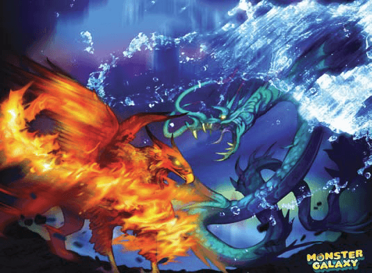
The monsters of Monster Galaxy, which we call Moga, are celestial creatures each belong ing to a zodiac sign. We wanted the game to be as broadly appealing as possible, so in an effort to attract both men and women, we aimed for each zodiac sign to include monsters that fell into one of three categories: Ferocious, Cute, or Quirky/Funny. There wasn’t a specific plan for how many monsters we wanted to make or a description of what each one was supposed to be. Instead, we gave our talented artists free reign to let their creativity flourish, drawing anything they were passionate about. This worked very well, resulting in an incredible variety of over 130 monsters.
Some early design decisions had a big impact on what we ended up building. When evaluating the classic RPGs that served as our inspiration, we saw many aspects that would translate well to a Flash-based game and some that didn’t make as much sense. For example, avatars didn’t seem to have a place in Monster Galaxy. We couldn’t see a clear reason why players would need to walk around a map since we wanted them to click on where they would like to fight and jump immediately into action.
For the game-play itself, we wanted the game to be a casual RPG with depth. We explored complex battle systems involving additional stats, more items, ways to customize specific monsters with equip-able attacks, and consumable accessories to make them more powerful. However, we found that none of those plans were truly making the game more fun. And so we kept the battle mechanics just simple enough that savvy players could improve their chances by making better decisions, but there was essentially “no wrong button to click,” and players were capable of making forward progress simply by clicking any buttons. Within this framework, however, we layered in depth by encouraging players to pursue any of three related goals: to capture all the monsters, to explore the whole map and complete all the quests, or to train their monsters to the highest level.
We wanted to flesh out the game world, making the game feel like an experience where everything “belongs.” Because we added small elements of story into our game mechanics, players could immerse themselves more fully into the game. One example is the way players can call a friend into battle to help them win a fight. This “bonus attack” comes as a result of using a “whistle,” which can be harvested from a whistle tree located at that friend’s ranch. Another simple example is our item shop. To frame the reason why players can buy items at any time from any location, we wrapped the shop in the fiction of being a “Sky Shop” where a helpful crew of Sky Cats fly around a mobile marketplace. By adding these charming elements to the game, we hoped the world of Monster Galaxy would feel coherent—as opposed to a jumble of social game mechanics slapped together.
The result of all of these decisions was that as soon as we started bringing in testers to play the game, we heard the same feedback time and time again: “This doesn’t look like a Facebook game.” We took that as a compliment.
It’s Not Their Fault They’re Doing It Wrong
User testing was absolutely critical before launching Monster Galaxy, and looking back, we feel it was one of the most valuable investments we made during the development process. We did three types of user testing: internal testing, Craigslist testers, and Usertesting.com.
Internal testing came first. Everyone on the team was encouraged to play the game and give feedback. There were many instances of developers or artists testing the game, noticing something that could be improved, and writing the idea down on the whiteboard to be fixed later. The turnaround time for this kind of rapid iteration was sometimes only a matter of days—often faster—and it is how we came up with many of the ideas for game features and UI tweaks.
Once the game was more stable and had a tutorial in place, we posted ads on Craigslist and Facebook offering to pay $25 for people to come in and be “game testers.” We brought in players of varying levels of experience, from those who were very familiar with Facebook or RPG games to those who had hardly played any.
We did not have a fancy setup for our user testing. We brought testers into a conference room, they played the game on a laptop and their screen was connected to a larger screen. The whole team sat around the table and watched them play. This proved to be quite effective and we caught so many instances of players getting stuck or confused that every user testing session left us with a great to-do list of things that we needed to fix to make the next session more successful.
The first rule of user testing was that we did not talk at all during the test sessions. We just let the testers play and we watched. If they made mistakes or got stuck, we did not help them. If they asked questions, we would not answer. Perhaps we’d reply with a follow-up question, like “Why are you asking?” or “What do you think you’re supposed to do?” But it was critical not to lead them towards a solution or create anything that made the test environment artificially constrained. We wanted to let the testers make mistakes. At the end of the session, we’d leave a few minutes to ask questions. “Did you notice that button? Why didn’t you click it?” “What would you do next if we hadn’t stopped you right now?”
Another important aspect of our user testing is that the entire team would attend these sessions. It was invaluable for the people building the game to watch players playing the game because each of us would spot something different—since you tend to notice the things that you have had a hand in. It was sometimes so painful to watch someone struggling with our UI, but that provided the greatest motivation to make improvements.
Sometimes user testing surprised us in unexpected ways. One notable example was when we brought in testers who were very familiar with games on Facebook and had them run through several battles in Monster Galaxy. One of the buttons in the battle interface calls a friend for a powerful bonus attack. We originally labeled this button “Call Friend.” However, we found that testers avoided this button and would almost never click it. Sometimes we could even watch as players would hover over this button for a second but decide not to click. We asked why these testers were so hesitant to click the “Call Friend” button, and the response was always the same: They were worried this button would spam their friends by forcing them to send a request or post to their wall. Indeed, they were turned away from clicking on anything that used the word “Friend.” It was notable how much the social gaming audience in late 2010 had grown weary of the viral tricks some applications used to abuse friend relationships. We changed the text on the button to instead say “Bonus Attack,” and despite the fact that the button did the exact same thing, the reaction was very positive. Testers specifically said how much they enjoyed and appreciated calling their friends into battle.
Finally, around the time that we were opening the game to public beta, we started using Usertesting.com extensively. This was a valuable tool for making sure new users were able to do everything they needed to do without getting stuck or frustrated. After the Usertesting.com sessions it became apparent to us that if we need a player to click on something, we should put an arrow on it. We also used Usertesting.com to watch testers play competitors’ games, which helped us nurture more of an intuition around how testers interact with games and what they react positively to. The tool helped us discover many of the clever aspects of successful games that we may not have noticed from our own biased viewpoints.
An important lesson we learned from watching Usertesting.com is that we simply could not have enough tooltips. Our original expectation was that gamers would explore the interface by clicking on the various buttons just to see what would happen. We hoped players would learn through trial and error and discover the game by exploring all aspects of it on their own. This was not the case. If we did not spell out exactly what was going to happen when you clicked on an attack, testers would not click on it, sticking instead with the one attack they had learned about in the tutorial. Rather than lengthening the tutorial to exhaustive absurdity, we took the approach of trying to incorporate education into the experience itself, explaining right in the moment everything there is to know about each attack with a large mouse-over tooltip. We worried at first that this would reduce some of the game-play, but we found the opposite to be true: The more informed players became, the more they enjoyed the game.
Once we arrived at a point where the testers were having so much fun playing that they couldn’t stop long enough to answer our questions, we knew we were ready to launch.
Now the Real Development Begins
Prior to launch, everything is guesswork— especially when you’re bringing to Facebook a whole new genre. You can try to make informed predictions with the help of marketing research and user testing, but nothing in the development of an online game compares to the amount of incredibly relevant and applicable information you get from launching to real users.
One major post-launch lesson that hit us hard was that we had, in fact, created a game for males. We had made efforts to make the game appealing to both genders, but males were more valuable users, demonstrating better stats of all of our four key metrics: retention, engagement, monetization, and virality. Women who did end up engaged monetized just as well, but it became clear once we had driven a significant install volume of both genders that it made more sense for us to focus on male users.
Another key post-launch lesson was that although we had balanced the two main items in the game to be equally scarce and necessary to make progress, the item associated with capturing and acquiring more monsters (Starseeds) had significantly higher sales than the item that restored your health and allowed you to continue playing (Blue Coffee). This information helped us to completely reprioritize our roadmap around true impact. In that sense the real development had just begun: We finally had all the tools we needed to move forward with confidence.
Although Gaia Online is an established online gaming community, Monster Galaxy was an expansion initiative. It was critical to be able to bring in a new audience to engage with our company’s products outside of our destination website. With this goal in mind, we turned extensively to acquisition marketing. We divided the spend into five tiers based on the country of the users and the potential lifetime value of traffic from that country. We further divided our spend within each tier based on gender and age range, and from there we experimented with everything. We optimized around reach and revenue, with the goal of acquiring users where we could earn back the cost of the acquisition in the first three months. However, shortly after our launch, we noticed we were earning back our investment in only two weeks, which allowed us to expand our marketing efforts and adjust our CPIs until we found a strategy that allowed for sustained growth for several months.
Small Changes Make a Big Difference
One of our initial design philosophies in Monster Galaxy, which became a catch-phrase among the team, was to “put a cat on it.” Whether it was modals, ads, icons, or logos, our initial instinct was to fill the game with cute cat-like creatures. This thinking stemmed from Gaia Online, where this aesthetic has worked incredibly well. So even though the game was about battling monsters, we rationalized that cats made sense and would help us attract both females and males.
It turns out that being gung-ho on cats wasn’t always the right decision. We had cats on everything from the welcome screen to the tutorial. When we started advertising our game, our marketing analyst found that one ad with a dragon preformed much better than our ads with cats, and he suggested we change the app permissions icon to a dragon. We gave it a try and it resulted in nearly a five percent increase in new users clicking “Allow.” This made it clear to us how important the new user experience is—not just the first five minutes, but indeed the first five seconds.
Another surprising post-launch lesson was whether or not we should show the intro movie. Monster Galaxy has a 20-second animated intro sequence which we felt helped frame the experience—similar to how an intro movie is used in many console games. However, because this movie wasn’t interactive, we grew concerned that players—especially new players— would leave before even seeing the game at all. We ran an A/B test in which we showed the intro movie to half of new players and skipped it for the other half. While indeed there were slightly more new players who got through the early portions of the game when we omitted the trailer, we were shocked to learn that users who see the trailer ultimately prove to become better users. There were significantly more users who came back the second day in the group that saw the trailer.
A/B testing is now an important part of our design process. We aim to A/B test nearly everything we do.
Just the Beginning for Games on Facebook
We continue to believe that building games for gamers is still the largest untapped opportunity in social gaming. The fact that we have been able to build and maintain our large user base for several months—while significantly decreasing our marketing spend and increasing our revenue—makes it clear that this is just the beginning for games like Monster Galaxy. As a final note, I see a huge opportunity for the mainstream gaming industry and the owners of the most popular video game brands to expand into social and mobile platforms. I hope to see the two worlds, social gaming and console gaming, become more connected in the future, and Gaia is in a great position to help make that happen.
Mike Sego is the CEO of Gaia Interactive, owner of social gaming community Gaia Online. He previously served as the Chief Product Officer for Gaia. Prior to Gaia, Mike was the creator and sole developer of the popular (fluff) Friends application for Facebook.
Originally published by Casual Connect Magazine. http://casualconnect.org/magazine-archive/
