- Wondering how to get Monopoly GO! free rolls? Well, you’ve come to the right place. In this guide, we provide you with a bunch of tips and tricks to get some free rolls for the hit new mobile game. We’ll …
Best Roblox Horror Games to Play Right Now – Updated Weekly
By Adele Wilson
Our Best Roblox Horror Games guide features the scariest and most creative experiences to play right now on the platform!The BEST Roblox Games of The Week – Games You Need To Play!
By Sho Roberts
Our feature shares our pick for the Best Roblox Games of the week! With our feature, we guarantee you'll find something new to play!Type Soul Clan Rarity Guide – All Legendary And Common Clans Listed!
By Nathan Ball
Wondering what your odds of rolling a particular Clan are? Wonder no more, with my handy Type Soul Clan Rarity guide.
Big Fish Games tests out new logo on its Facebook page
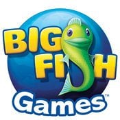
In the Downloads space, Big Fish Games is a big player. So, it’s sort of big news when they test out a new logo unless the change to the logo is so minute many will not notice it. Side-by-side comparison and my analysis below the fold.

In the Downloads space, Big Fish Games is a big player. So, it’s sort of big news when they test out a new logo unless the change to the logo is minute many will not notice it.
Check out the new logo on Big Fish’s Facebook page. Felix, the iconic fish, is still there. But, instead of being in front of planet Earth, he’s sitting in front of a blue circle. It’s a slight change, but you can see the side-by-side comparison if you click to Big Fish’s Facebook photo page to see before…and after.
What does this mean? Is Big Fish saying that they don’t want to imply that they are the King of the World as Leonardo DiCaprio would scream from the deck of the Titanic? Does their marketing department have too much time on their hands? Or, is this just a nice change to make their logo more simple and easier to view on various devices such as the iPhone or iPad?
My vote is the answer behind Door #3. The new logo is a slight change but will render quite on any device or screen resolution because there is less background detail. But what do you think? Comment below.
More articles...
Monopoly GO! Free Rolls – Links For Free Dice
By Glen Fox
Wondering how to get Monopoly GO! free rolls? Well, you’ve come to the right place. In this guide, we provide you with a bunch of tips and tricks to get some free rolls for the hit new mobile game. We’ll …Best Roblox Horror Games to Play Right Now – Updated Weekly
By Adele Wilson
Our Best Roblox Horror Games guide features the scariest and most creative experiences to play right now on the platform!The BEST Roblox Games of The Week – Games You Need To Play!
By Sho Roberts
Our feature shares our pick for the Best Roblox Games of the week! With our feature, we guarantee you'll find something new to play!Type Soul Clan Rarity Guide – All Legendary And Common Clans Listed!
By Nathan Ball
Wondering what your odds of rolling a particular Clan are? Wonder no more, with my handy Type Soul Clan Rarity guide.


